 |
||||
|
Like PageMaker before it, Adobe InDesign is quite clever when it comes to using frames as masks. Of course there's nothing unique about changing the shape of a frame and then putting text or graphics inside it, but InDesign gives you several options in how the framed content is treated. If you look quickly through the following pages, you may realise that just about everything we're going to show you how to do can be done in any vector graphics application. But doing so within InDesign directly has a number of advantages. Principally, it can save you switching back and forth between InDesign and your illustration program whenever a graphic needs changing. If you need to change its colour, layout or content, you just do it on the page. There's also the dual issues of colour and layout accuracy which always arise when trying to place imported EPS graphics on the page. All you see on-screen with an imported graphic is a ropey-looking fixed-resolution 8-bit preview. But if you create the graphic within InDesign, it’s displayed in full anti-aliased glory with the correct document colours and can be positioned with precision. When it comes to output, there's one less loose graphic file to worry about. A third reason to try out the project here is that experimentation should trigger more creativity in your work. Once you get the hang of combining, overlapping and nesting frames, you'll start to appreciate the graphic power of InDesign and stop treating it like a surrogate QuarkXPress. Alistair Dabbs |
||
 |
||
|
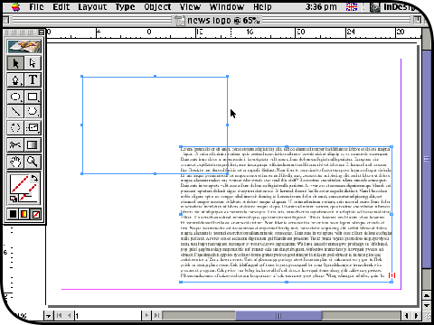
Start with a new InDesign document or use an existing one it doesn't matter. All you need for this project is any plain text file and any photo image; everything else will be created within InDesign. Type command-D or select Place from the File menu and locate the text file. The cursor will become 'charged', so you can just click and drag to create a frame into which the imported text automatically flows. Click on the Rectangle tool (or just press M) and drag out a smaller empty frame next to it. |
||
 |
||
|
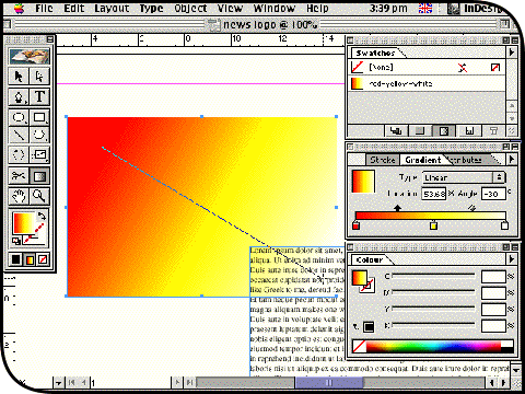
Open the Gradient and Colour palettes from the Window menu and use them to create a new linear gradient as shown: warm red at the left, white at the right and yellow in the centre. Open the Swatches palette, click on its pop-up menu and select New Gradient Swatch. In the New Gradient Swatch dialog box, give it a name (we've called it 'red-yellow-white') and click OK to add it to the palette. Click on the empty frame and apply the gradient to it as a fill. Change its stretch and direction by dragging with the Gradient tool diagnonally as shown. |
||
 |
||
|
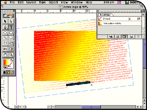
Now switch to the Type tool (T) and click on the text frame. Make sure you have activated the text you imported earlier rather than initiated a new text frame on the page. Press command-A or choose Select All from the Edit menu to highlight all the text in the frame. Click on the gradient swatch to apply it across the highlighted selection, and use the Gradient tool to send the gradient in the opposite direction to that in the empty frame. When you drag the text frame over the top, you will see a crossover effect similar to the one shown here. Use the Rotate tool (R) to swivel the text frame around a little. |
||
 |
||
|
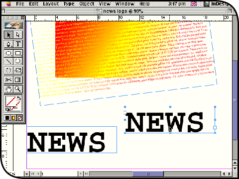
Elsewhere on your page, drag out a new text frame with the Type tool and type the word 'NEWS'. Drag over the text to highlight the letters and increase its point size and change the font using commands from the Type menu. Find a blocky font and increase the point size to at least 10 times that of your imported text in the large frame. Hold down the command and option keys, then click and drag this text frame to one side; this creates a duplicate. |
||
 |
||
|
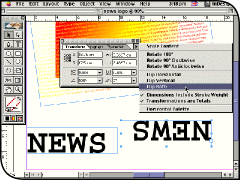
Click on the Selection tool (V) as you will not be editing the text in these two little text frames any more. Select one of the two and use the Rotate tool in combination with the shift key to swing it around by exactly 180°; the shift key of course constrains the rotation to 45° increments. Alternatively, open the Transform palette from the Window menu, click on the palette's pop-up menu and choose Flip Both. Either way, the result is an upside-down version of the 'NEWS' text. |
||
 |
||
|
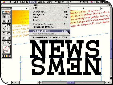
Drag the upside-down text frame over to rest directly under the original, as shown. With the frame still selected, choose Create Outlines from the Type menu (or press command-shift-O). This converts the text into closed vector paths, and you will no longer be able to retype the letters unless you choose Undo from the Edit menu. You may also notice that InDesign's text anti-aliasing effect is removed. Click on the text frame above it and do the same thing. Finally nudge the two newly created outline objects to fit more snugly, if necessary. |
||
 |
||
|
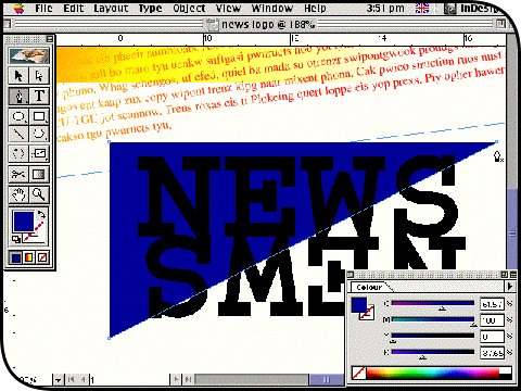
Switch to the Pen tool (P) and click once slightly above and to the right of the pair of 'NEWS' outline objects. Hold down the shift key and click a second time slightly above and to the left of the objects; the shift key keeps the path nodes perfectly horizontal or vertical. Keep the shift key down and click at the bottom left, then let go and click back on your original point to close the path. Fill the triangle you have just created with a solid blue colour (no stroke) and send it behind the 'NEWS' objects by pressing command-[ a couple of times. |
||
 |
||
|
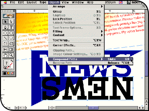
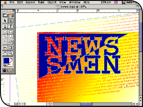
Switch back to the Selection tool and click on the top 'NEWS' object. Hold down the shift key and click on the blue triangle shape so that it is selected as well. Press command-8 to combine the two selections into one vector object; alternatively, click on the Object menu, drag down to Compound Paths and choose Make from the submenu. Hold down the shift key, click on the bottom 'NEWS' object and press command-8 again. The effect will be to invert the colour fill according to how the original objects overlapped. |
||
 |
||
|
Note that the 'white' areas are in fact holes in the compound vector object you have created. You can also drag it around as a single unit using the Selection tool. Drop it over the overlapping gradient-filled frames you set up at the beginning of the project. Remember too that the gradient text is still fully editable, so you might want to select it all with the Type tool and reduce the point size further so that more of it shows through the holes in the compound object. |
||
 |
||
|
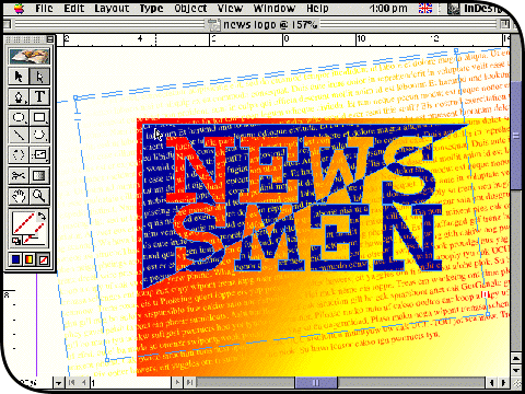
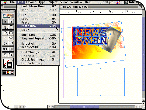
So far, you have simply overlapped transparent and masking frames. Now with the Direct Selection tool (A) click on the gradient text frame and copy it to the clipboard by pressing command-C. Immediately click once in the blue area of the compound 'NEWS' object and press command-option-V or select Paste Into from the Edit menu. This nests a copy of the text frame inside the object. You can change the way it is cropped by dragging with the Direct Selection tool; if you use the plain Selection too, you will end up moving the whole object. |
||
 |
||
|
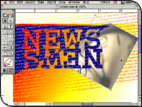
Press command-D (or choose Place from the File menu) and locate a photo image. When the cursor appears loaded, click anywhere to bring it onto the page. Then crop and resize it as required: drag on a corner with the Selection tool to crop the image, hold down the command key to resize, and hold down the shift key as well to maintain aspect ratio. Use command-[ repeatedly to send the image behind the 'NEWS' object but in front of the background gradient-filled frames. Obviously sandwiching new objects between others is easier if you build your page artwork across layers. |
||
 |
||
|
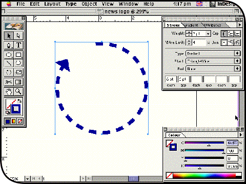
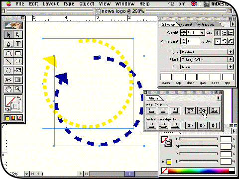
Here's another overlapping effect you can try. Click on the Ellipse tool (L), hold down the shift key and drag out a circle. Use the Scissors tool (C) to remove a small section from it. Open the Stroke palette from the Window menu and give the path a heavier weight, change the Type pop-up to Dashed, and enter 6pt in the first pair of 'dash' and 'gap' fields. Change the Start pop-up to TriangleWide, and you have a perfectly rounded, dashed, arrow-headed curve. Apply a colour to it. |
||
 |
||
|
Click on the Selection tool and option-drag the curve to make a duplicate. Leave the stroke weight of this duplicate the same but change its 'dash' and 'gap' settings to 3pt. Shift-click the original curve object so that both are selected, open the Align palette from the Window menu and click on the Horizontal Centre and Vertical Centre buttons to get them to overlap precisely. Press command-G to group the pair, which now looks like a single two-colour object. Drag it over onto your main artwork and resize, duplicate and rotate it as you fancy. |
||
 |
||
|
Zoom out with command-zero to view the whole page. Select everything you have created so far by dragging a marquee over it with the Selection tool. Press command-G to group it. Now click on the Rectangle tool (M) and drag out a new, smaller frame. Switch back to the Selection tool, click on the grouped artwork and copy it to the clipboard with command-C. Click on your new empty frame and press command-option-V or select Paste Into from the Edit menu. This nests the group inside, letting you casually drag on the frame nodes in order to crop it exactly how you want it. |
||
 |
||
|
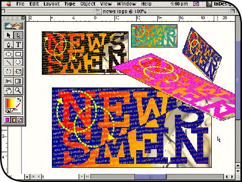
You now have a standalone logo that can be copied, duplicated and resized at will. The main drawbacks with graphics created like this are that they slow down screen redraw a little and make for big file sizes. The big advantage is that they are instantly re-editable (click inside the graphic with the Direct Selection tool) and much easier to manipulate in various ways directly on the page. Just remember that you will need to use the Resize tool (S) in order to enlarge or reduce the graphic properly: simply command-dragging with the Selection tool will not resize the point size of the text elements. |
||