 |
||||
|
InDesign's superiority over QuarkXPress for advanced typography is a matter of record. Features such as the multi-line composer for improving the appearance of justified text and optical margin alignment for slick overhanging punctuation have convinced many designers, if not production desks, to join the Adobe bandwagon. But there's a great deal more control over the treatment of fonts hidden in the program if you know where to look. For example, InDesign has been built to support new font technologies such as Unicode. This is especially useful for anyone trying to work in multiple languages, especially foreign scripts, as the Unicode standard effectively expands the potential for glyph variations within a font. In other words, it could be possible to produce pages in English and Russian without actually changing font: you just use different characters available within it. We'll investigate InDesign's treatment of new fonts, including Multiple Masters, over the next few pages. Besides this, InDesign provides a number of special options for character handling which apply to regular Type 1 PostScript fonts equally well. They go beyond standard kern and track tools, and let you make decisions on the flow and appearance of text on a document-wide, paragraph or character-specific basis. Not least, there is even an intelligent and reliable way around InDesign's much-misunderstood inability to italicise text when no italic face is available for a particular font. Finally, we'll touch on the several case-changing options and font substitution controls in the recently released upgrade to InDesign 1.5. |
||
 |
||
|
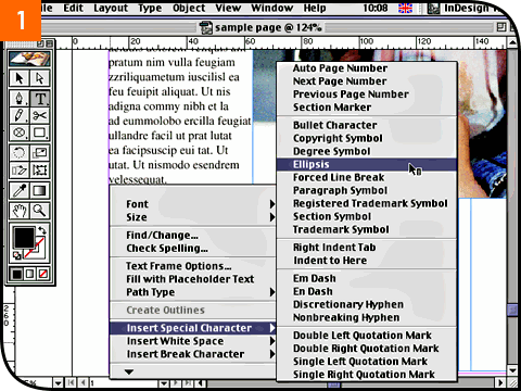
Starting with the basics, every InDesign user should already be aware of the program's context-sensitive pop-up menu while editing with the Type tool. With a text box active, just hold down the control key and click to call it up. One of the key features here is, of course, the Insert Special Character command [01]. Expert users will be better served by learning the quick keyboard combinations to generate special characters such as bullets (•), degree symbols (°) and the copyright mark ((c)), but this pop-up is very useful for often-forgetten typographical glyphs such as the ellipsis (...) and conditional hyphens. |
||
 |
||
|
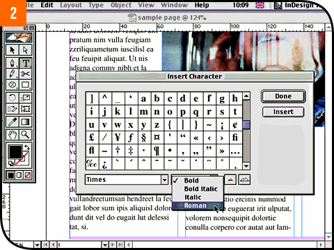
Still on the basics, don't forget that InDesign provides its own built-in character map dialog. From the Type menu, select Insert Character [02]. It's a shame this dialog isn't presented as a floating palette - this would let you add special characters on the fly without interrupting your work - but it has one important benefit over utilities such as Key Caps: it's completely independent of the keyboard layout. This way, InDesign lets you see the entire glyph set, no matter how big and whether or not your current keyboard language layout can actually access them all. Quality PostScript fonts from the large type foundries tend to include plenty of genuine glyph alternatives to take advantage of but you may not have realised were available to you. |
||
 |
||
|
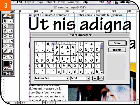
There's no better example of this than if you click on the font menu at the bottom of the Insert Character dialog box and switch to an OpenType font (based on Unicode technology). InDesign is shipped with a sample OpenType font called Tekton Pro which is worth trying out to see how InDesign provides an interface to its expanded character set. Instead of just presenting a massive chart of glyphs, related glyphs are grouped together behind their principal character [03]. The availability of alternatives to each principal character is indicated by a little pop-up menu arrow: click and hold down on it to see the pop-up choices. For example, an OpenType font might include specially created small caps characters or superscript characters (such as 'st', 'nd', 'rd' and 'th' after numbers) which look and print better compared with the usual artificially generated forms. |
||
 |
||
|
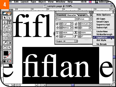
Quality fonts, whether OpenType or Type 1, are likely to include a selection of ligature characters. Although the limitations of desktop publishing in the late 1980s pretty much killed off the popularity of ligatures for a while, they're once again being treated as typographically desirable. InDesign respects both camps by letting you activate or disable ligatures as a character attribute rather than a document preference. The toggle is available under the pop-up menu in the floating Character palette [04], and can be set before placing text on the page or applied in an ad hoc fashion afterwards to selectively highlighted text. |
||
 |
||
|
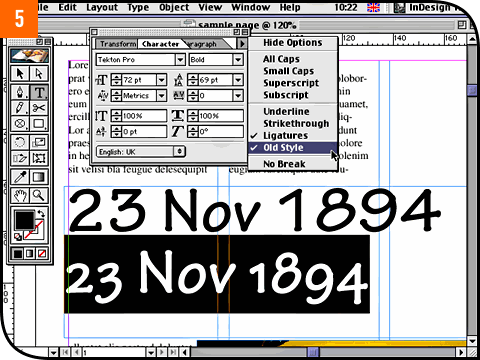
Just below Ligatures in this pop-up menu is an item called Old Style [05]. Again, this will only work if your font contains the appropriate glyph alternatives. Old fashioned type standards treated numerals like letters, giving them ascender and descender details. Modern typesetting, especially for headlines and tabular layouts, prefers numbers to fill the space of capital letters and ranged strictly on the baseline. If your font contains both styles of numerals, you can use the Old Style option to switch between them. Because the toggle does not affect letters, you can highlight entire text stories and apply the change quickly to everything if you want. |
||
 |
||
|
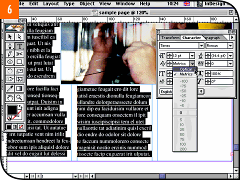
While you have the Character palette open, take the opportunity to experiment with the top kerning options in the Kerning pop-up [06]. Normally, you would use this pop-up or the Kerning field to enter a specific kern value for two adjacent characters having placed the flashing Type tool cursor between them. If you want to apply kerning across three or more characters at once, you'd have to use the Tracking control instead. But with several characters selected, or indeed an entire story, you can choose between Optical and Metrics kerning. Metrics refers to the built-in kern tables for a particular font, while Optical is InDesign's own advanced dynamic kerning system which attempts to produce better visual results based on the perceived optical shapes of the characters at their current point size. Generally speaking, Optical kerning does look better but note that it usually tightens the overall track, so applying it halfway through a layout job can cause a reflow. |
||
 |
||
|
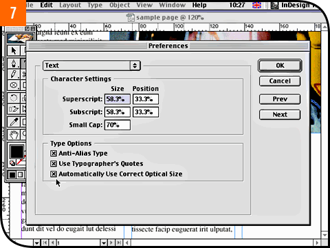
On this subject, you'll be aware that quality fonts are built with hinting details, especially in the serifs, to maximise the legibility of characters across different point sizes. Multiple Master fonts, for example, include a function for presenting the most appropriate optical character detail according to the size they are set to on the page. InDesign lets you enable this as an automatic function for all Multiple Masters if you want (which is generally recommended). To switch this feature on or off, click on the Edit menu, drag down to Preferences and select Text. The last item in the dialog box is the toggle you need [07]. |
||
 |
||
|
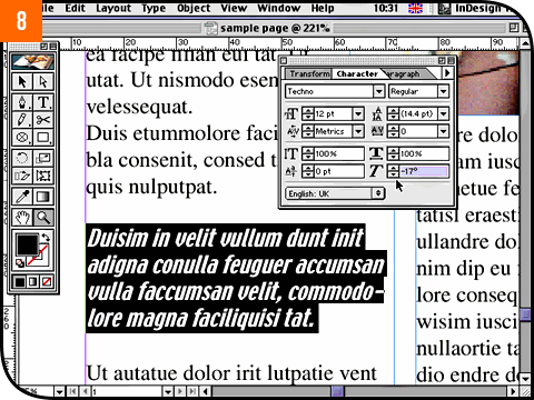
When InDesign was first released, users were split between satisfaction and dismay to find that the program refuses to entertain artificially italicised and emboldened text when no actual italic or bold faces are available. QuarkXPress lets you do it, much to the chagrin of bureaus as these artificially styled fonts look fine onscreen and often output to local proofing printers, but the style is lost when sent to film or plate. But while InDesign won't let you apply an artificial style, the Character palette does let you apply a PostScript-clean slant to any selected text [08]. When no italic face exists for the font you're using, this PostScript-clean approach to artifical slanting can be a real gift. |
||
 |
||
|
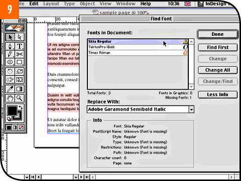
A couple of new type features were introduced with InDesign 1.5 which are well worth rooting out. One is the much-improved identification and handling of missing fonts. When you open a document that contains fonts that you don't have installed on your Mac, InDesign now prompts you with the Find Font dialog box [09]. This not only gives you the opportunity to find and replace missing fonts like QuarkXPress but gives full information about the fonts that are used, including type, character count and even the path of the font files. You can call up the dialog at any time by choosing Find Font... from the Type menu. |
||
 |
||
|
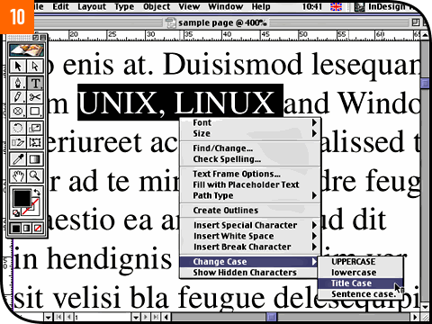
Otherwise, InDesign uses its own Multiple Master fonts to emulate a missing font in the same way that Acrobat Reader does. This means if you ignore the initial missing font warning, it's easy to forget about them. So click on the Edit menu, drag down to Preferences and select Composition. Put a check next to Substituted Fonts in the Highlight section. Any missing fonts that are being emulated will be marked clearly on the page as a reminder without interrupting your work. Finally, typographers and production desks alike should take note of the Change Case command, again easily available from the control-click pop-up menu while editing text [10]. As well as being able to switch between upper and lower case without any retyping, there's a handy Title Case option. Although it's intended for styling American headlines with initial caps for each highlighted word, this is a great feature for dropping down all-cap expressions such as acronyms that your house style might prefer as upper and lower case. There's nothing to retype and you can always change your mind again later. |
||